The World Bar— A progressive bunch who like to keep it interesting
-
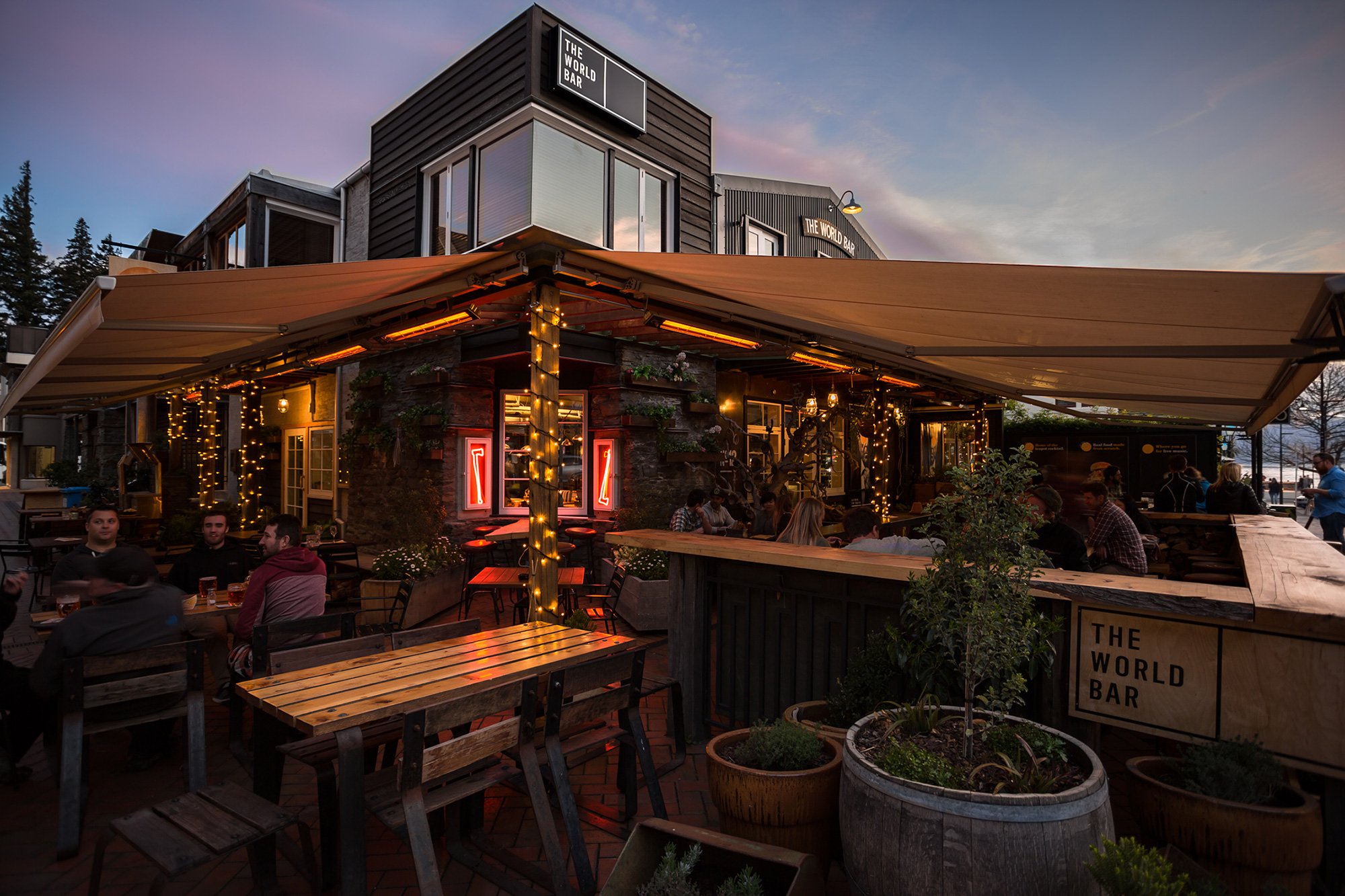
The World Bar Queenstown hosts incredible adventure film movie premieres; banging parties with notorious DJ's; live music both local and guest affiliated, and has served burgers to the masses and mixed famous teapot cocktails for Queenstown’s party animals. So whatever time you visit, they're sure to have something special waiting for you. The World Bar Queenstown is a progressive bunch who like to keep it interesting and are not happy to settle for mediocre.
CONTEXT
First established in 1996, they finally reopened in 2015 after a devastating fire (starting in a neighbouring business) burned their iconic and beloved bar to the ground in 2013. We were posed the challenge of communicating the re-opening as a new beginning but without neglecting the history and soul of the Brand. We wanted to achieve an international brand look. The biggest challenge was that our design needed to cover a range of different targets each night.
SOLUTION
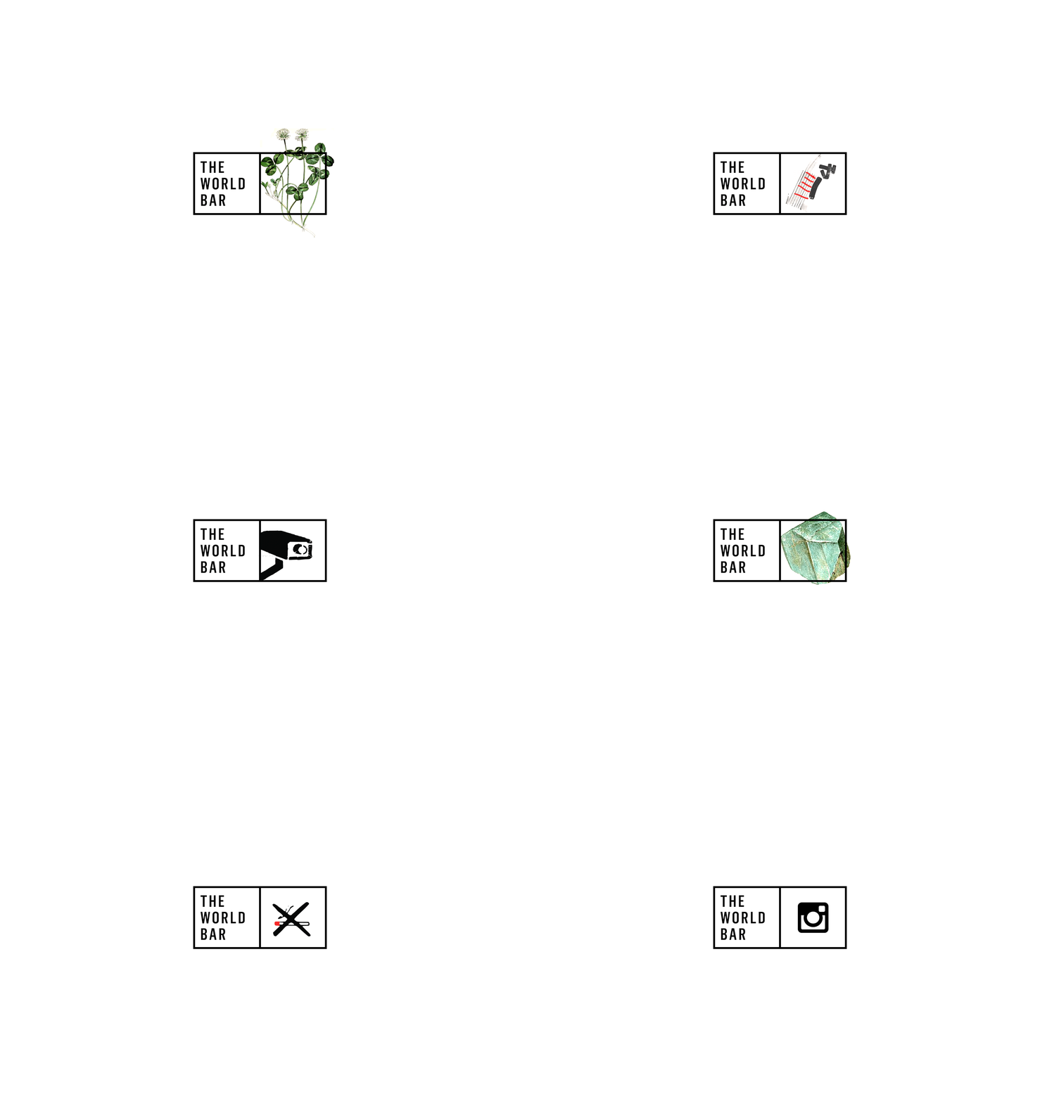
Our response to this challenge was to create a brand where we have a space that never changes, timeless, which represents the soul of the brand. We structured the brand to have flexibility so that we could cover the demands of the business. A simple and clever idea. We also focus on symbolise the concept of a "new beginning" through a point, as "point" of departure. It's a simple concept, direct and effective. Also the choice of adding the yellow as the main component in the communication is because this colour is associated with happiness, joy and optimism. We also wanted to generate visual impact, and we consider yellow is often used to draw attention. This colour is accompanied by identifying warm colours and earth colours, to contrast the power and dominance of its luminosity.The development of the sub-brands were also developed through a dot with a top view of the icons, providing unusual perspective and a unique look, which relates to the concept that one experiences many such unusual moments at The World Bar. As for the ‘copy’ material, you will see throughout our work that has been modified. At the beginning we worked with the idea: "be the first, taste the south", which later evolved to "stop for some, home for many" because we believe that in this way we were providing a better communication space for tourists and locals. Finally the advertising that we worked hard to promote for the opening was based on the phrase "old dog, new tricks" referring to a fresh new place that has history and personality.
CREDITS
Photography: Troy Tanner
Illustration ‘The Great Outdoors’ by Peter Lloyd
PUBLICATIONS
Promopress, Barcelona
Gestalten, Germany
Package & Design Magazine, China
GSM Vol 8, New Zealand
Send Points Publishing, China
Novum Vol 02.17, Germany
Novum Vol 04.15, Germany
Rockport Publishers, USA
INTERVIEW FOR NOVUM MAGAZINE—AUS & NZ VOL 04.15
What was it like working for The World Bar? “It was a great challenge, as our job was to redesign a Logo that had been established in the market in Sydney for many years. To make it work for the business model of our client, we had to develop a flexible logo that can adapt to different situations without losing its identity. It was a very enriching experience for us, we worked a lot as a team, constantly reviewing where we were going and searching for a very solid concept.”


